
Today the International Energy Agency delivered its World Energy Outlook, edition 2013 . One picture says more than a thousand words, they must have been thinking, because we get loads of Powerpoint sheets and pictures. All this work just to report that it’s business as usual, although there are some issues requiring our attention.
The report itself is available for €120, even though all the IEA’s work is payed by us, the tax payers. I will leave this shameful practice for what it is, because there is more important ranting to do. On page 5 of the press information kitt we find:
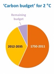
You see, we have this little issue with the Philippines. In order to prevent the Pacific from starting to boil, there is a growing consensus that something needs to done about the rising (sea) temperatures. The world community seems to agree that we need to have some sort of “carbon budget” that we must not exceed in order to prevent temperatures from rising 2 degrees above pre-industrial levels. The picture above tells this story.
“Nice pie chart”, I thought. But than I looked again and saw this “1750-2011” label. Wait a minute! Is this pie chart really showing all the carbon ever used since James Watt invented the steam engine?Wow! The yellow slice is all the carbon that “we” will use between now and 2035, it’s our “budget”. The other slices are all the carbon used in history PLUS all the carbon ever to be used by mankind after 2035. I think that that story needs more detail than a three slice pie chart. I created the graph below with data from Carbon Dioxide Information Analyses Center:

(Reduction of CO2 emissions by 0.5% per year after 2012; 1/12 of CO2 budget remaining for all future generations.)
Inconvenient isn’t it? More than half of all the carbon dioxide mankind will ever emit will be from the generation now alive. All the cars, coal plants, holiday trips to the tropics, summer air conditioning, just-in-time production schemes, warehouse on wheels invented in the 70’s-80’s-90’s are using 2/3 of all fossil energy ever to be used by mankind. That is our generation doing this, we created this mess, we signed the climate contract with the planet blindfolded, we accepted the consequences.
The contract says we will leave as much fossil fuel (for heating homes, cooking and maybe even some driving) to our children as our (grand) parents used in the 50’s and 60’s of the last century.
I think that the whole WEO report can be binned and replaced with just one line of text:
Stop burning fossil fuels now!
Isn’t it a reassuring idea that our governments are using the WEO-report as a primary source for energy (let alone climate) policy decisions? Give your kids a good hug tonight, it may be all the warmth they get in the rest of their lives.
Ps. As Manjana Milkoreit (@ManjanaM) pointed out, the IPCC has calculated that our generation will actually burn ALL the remaining carbon budget before 2035, so “My” graph is highly optimistic, in leaving something for our kids and grandchildren.
Pps. This article went viral on Twitter today, and I felt a little uncomfortable about my guesstimate chart below (including typo) that was in the original version of this post. I am happy that my gut feeling was so much in line with real historic data:

Pps.
Others have used information in this article to write own blogposts!
– Mark Trexler
– Paula Reed
– David Appell
other articles in English on this site (the rest is in Dutch)
![]()
Geef een reactie